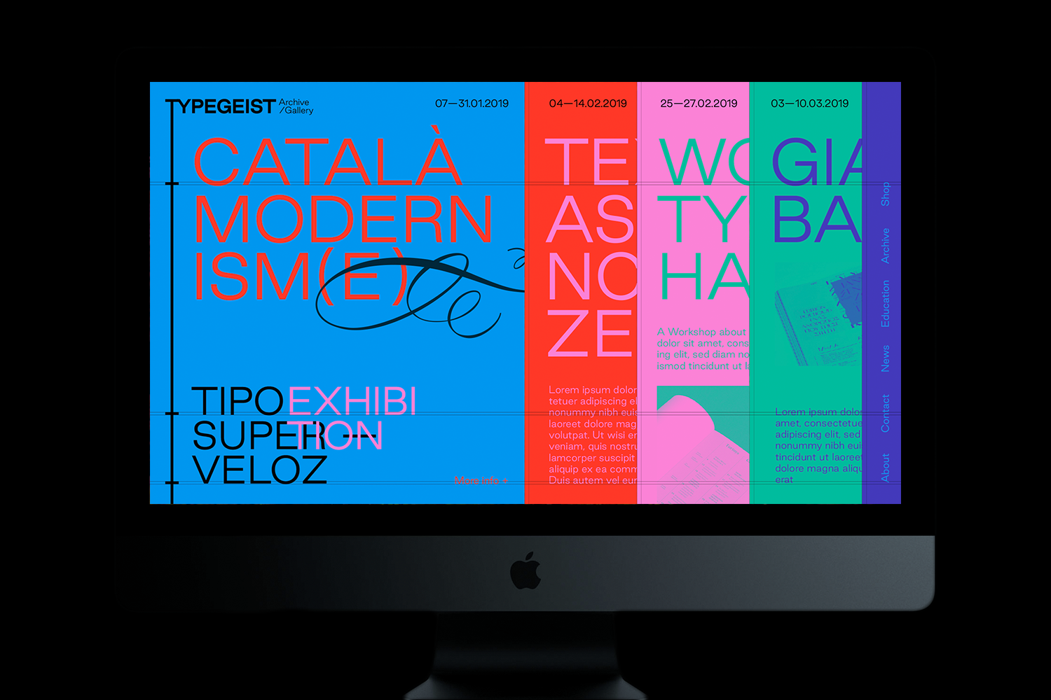
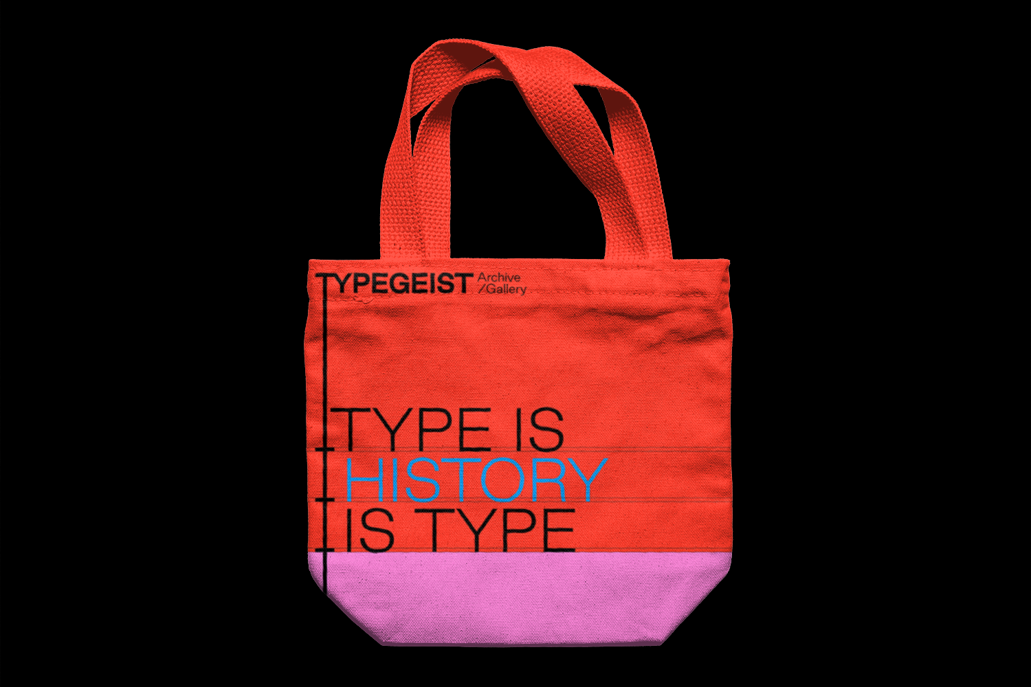
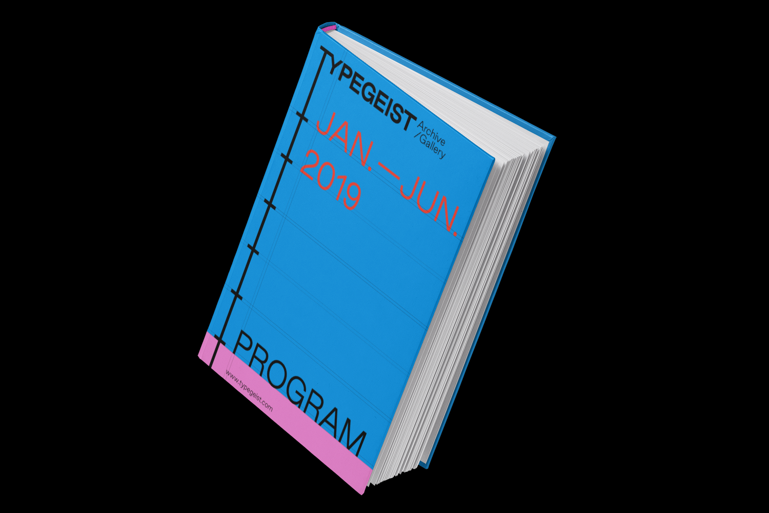
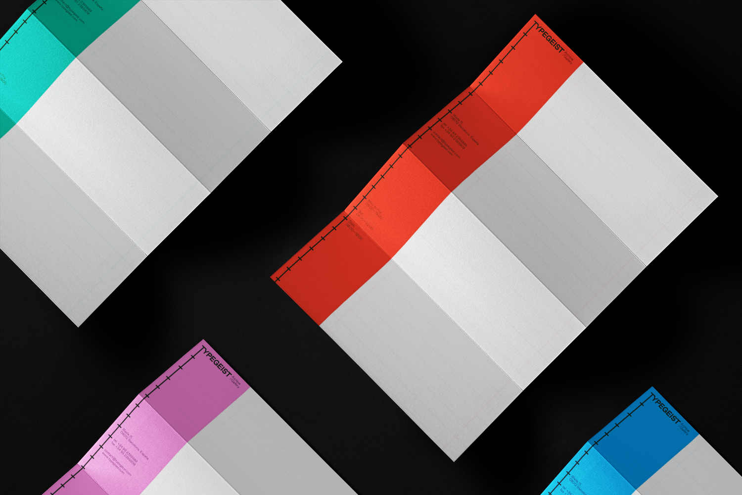
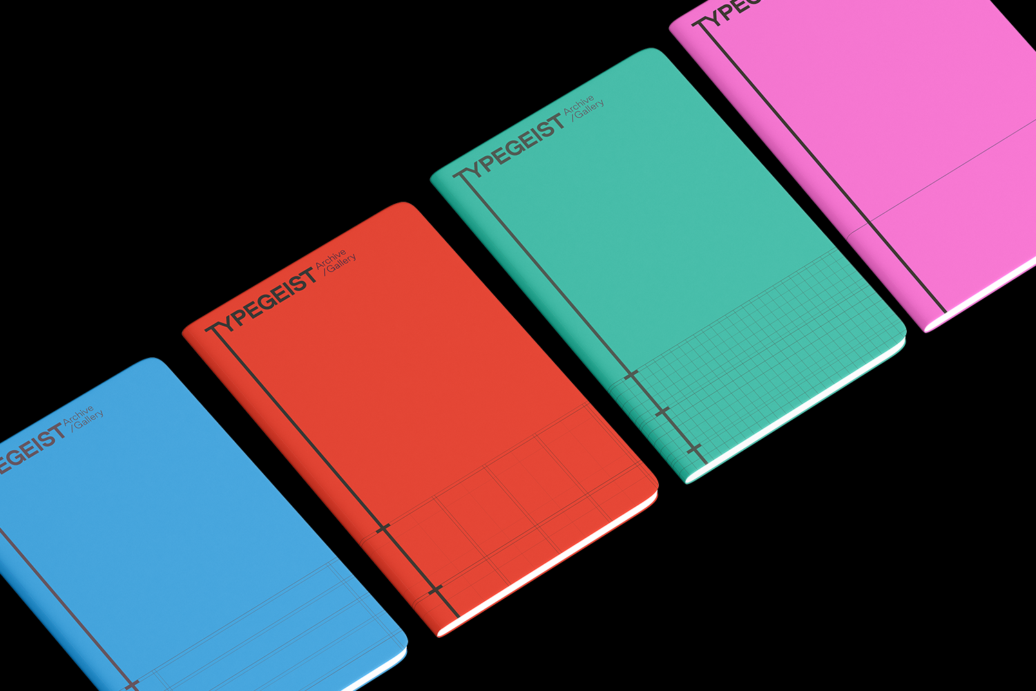
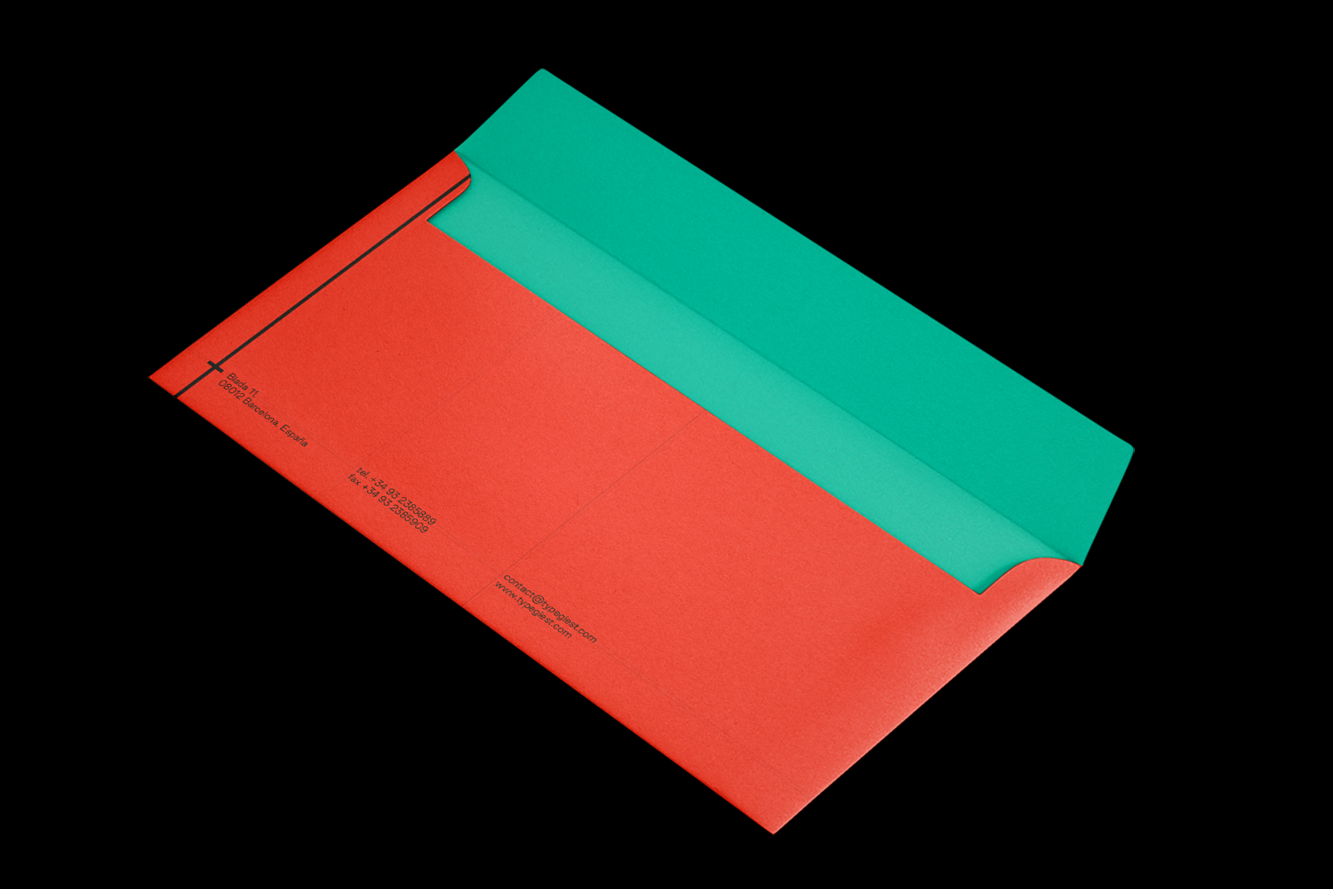
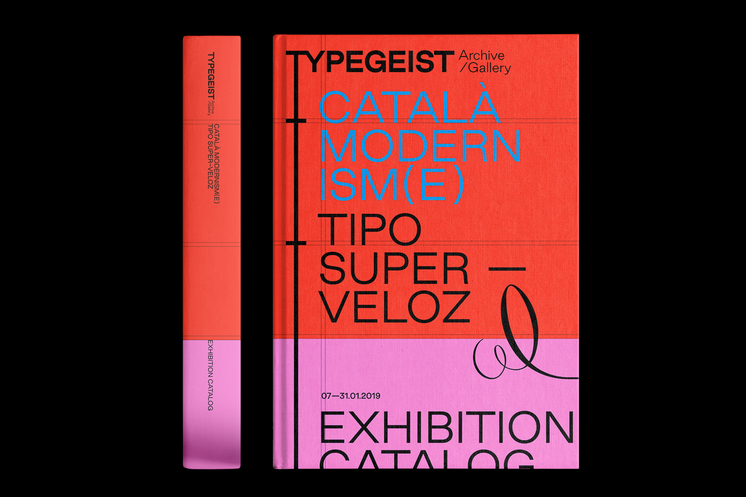
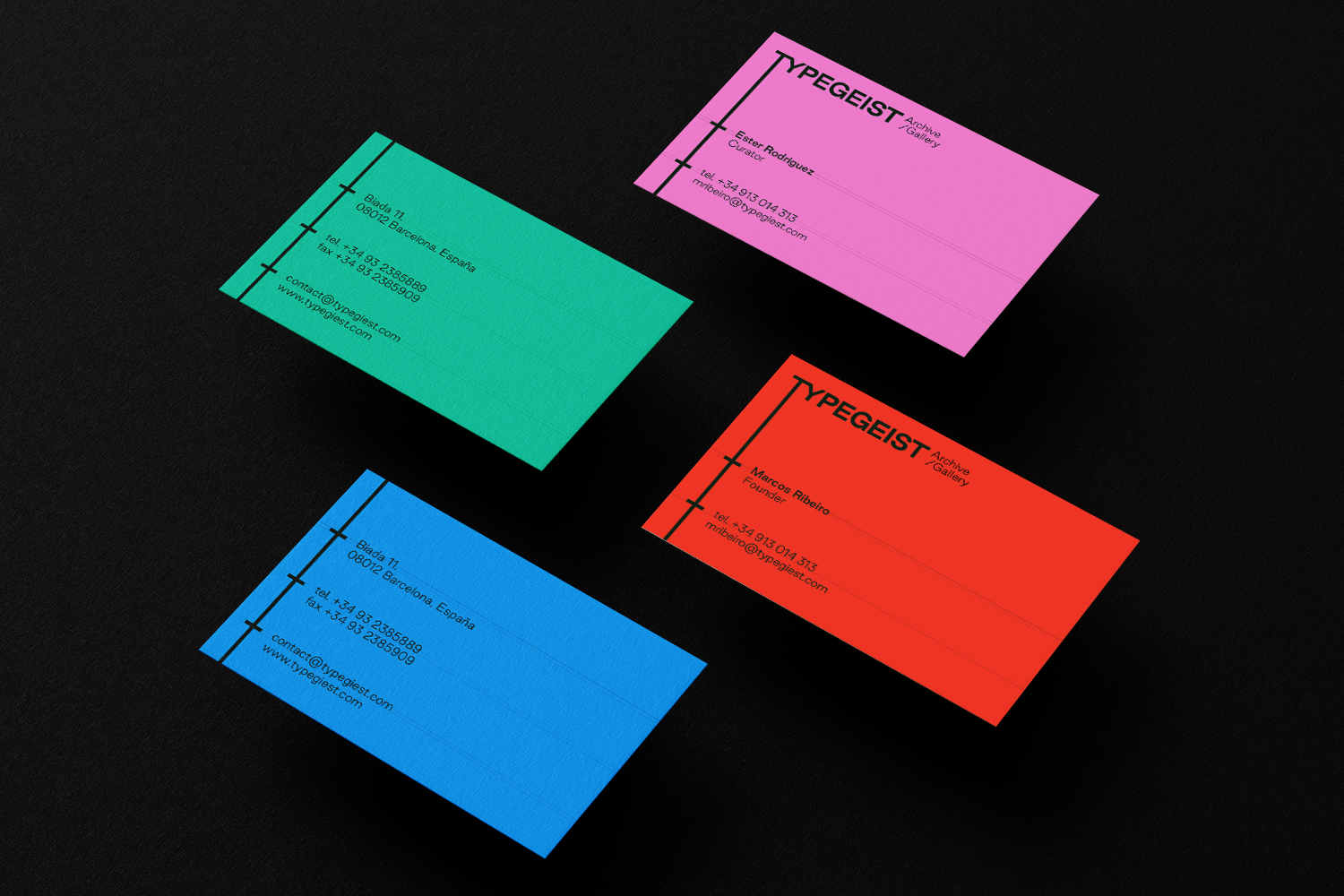
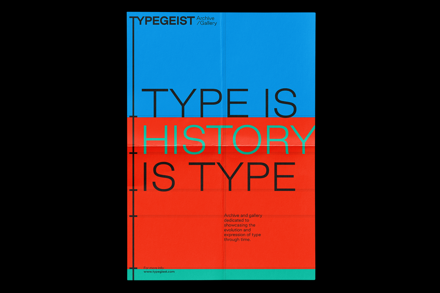
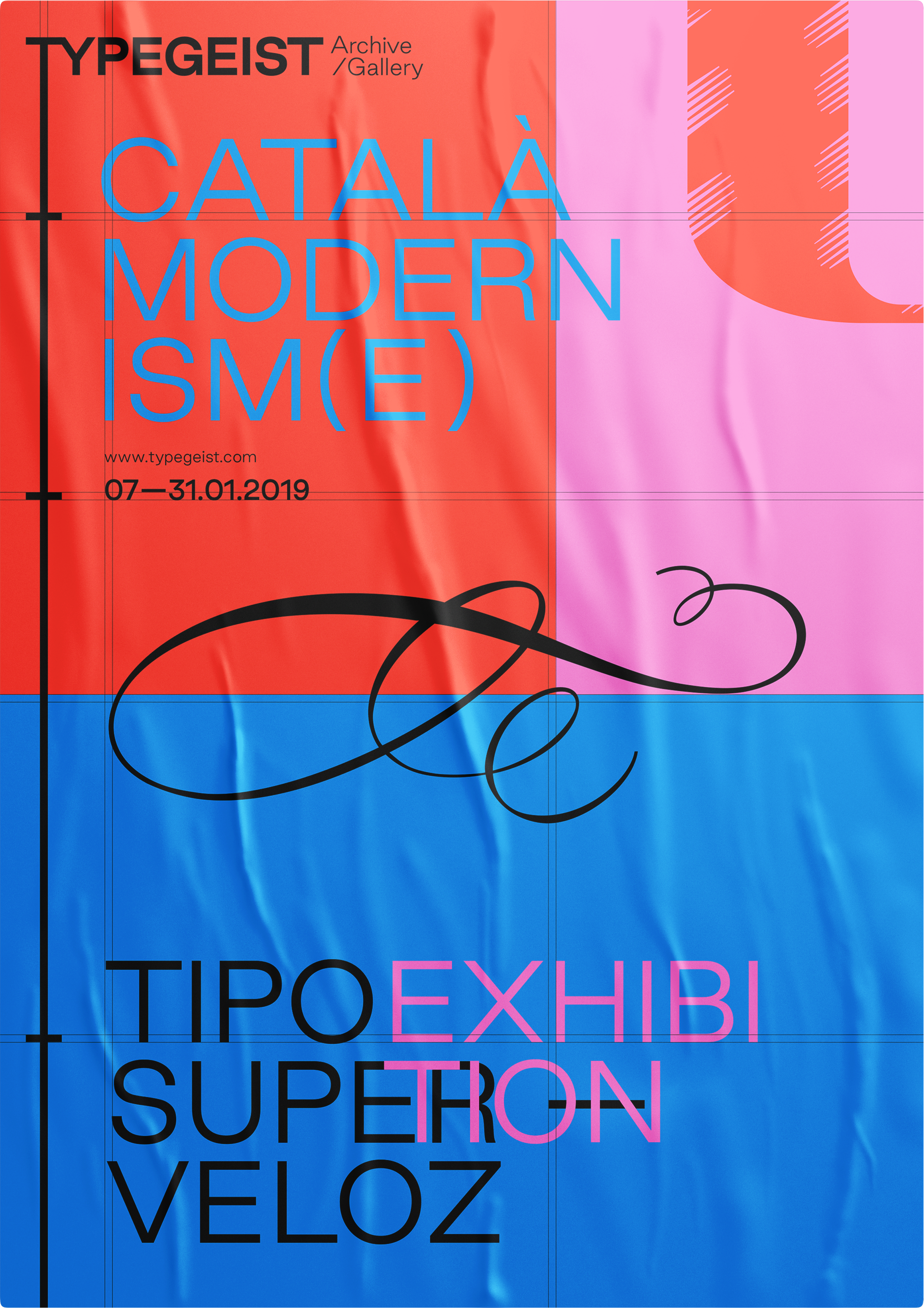
 Exhibition poster showcasing the graphic system in use.
Dimensions 500x750mm
Typegeist
is an archive and gallery dedicated to the conservation and exhibition of typography.
The concept of this institution is that it showcases type from different eras and geographical locations, correlating it with the culture that influenced it. The name itself was created having this concept in mind, meaning Type (from the word typography.) and geist (from the German word zeitgeist. meaning the spirit of an era or epoch).
The designed graphic language also expresses this concept. The base unit is the grid, the same unit used to design type. This graphic system establishes rules that allow the identity consistency, making it easily identified, and at the same time allows it flexibility of expression, so that any new exhibition from any era, being it past, present or future, can be easily incorporated in the many design matters necessary to advertise and showcase it.
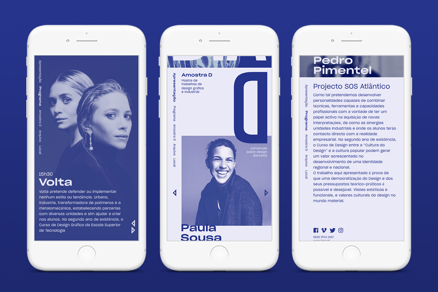
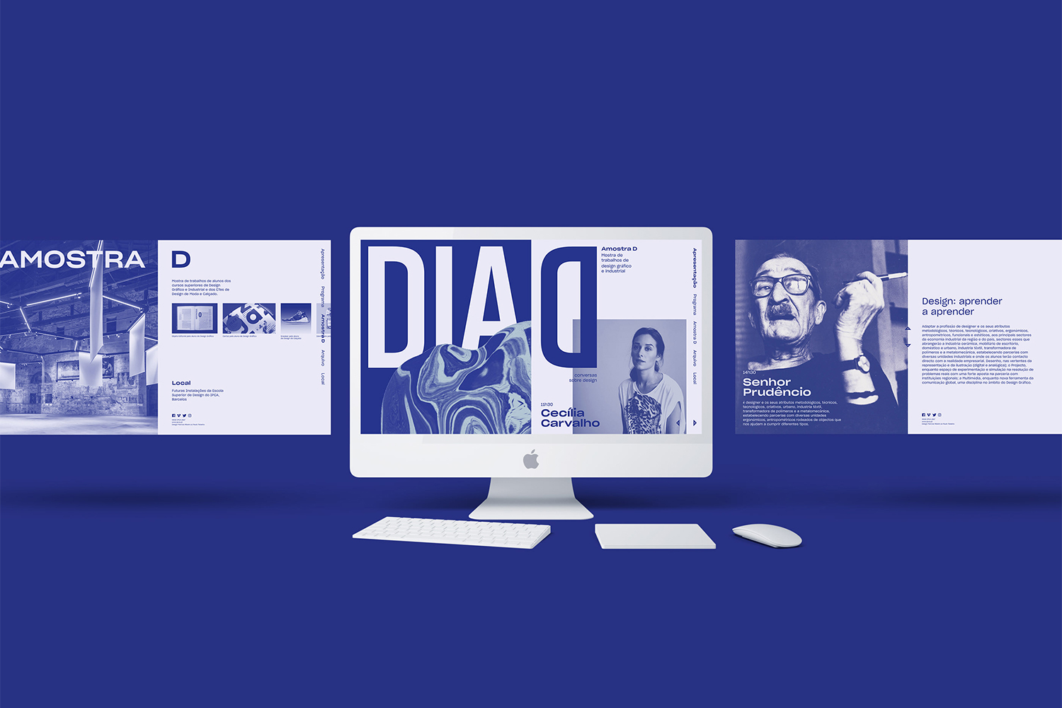
Dia D
is an anual event organized by Escola Superior de Design IPCA with the support of the Barcelos County. It aims to expose the design students and the curious, the experiences of the professional world of design, of the invited speakers, as well as value the practice of design in the region.
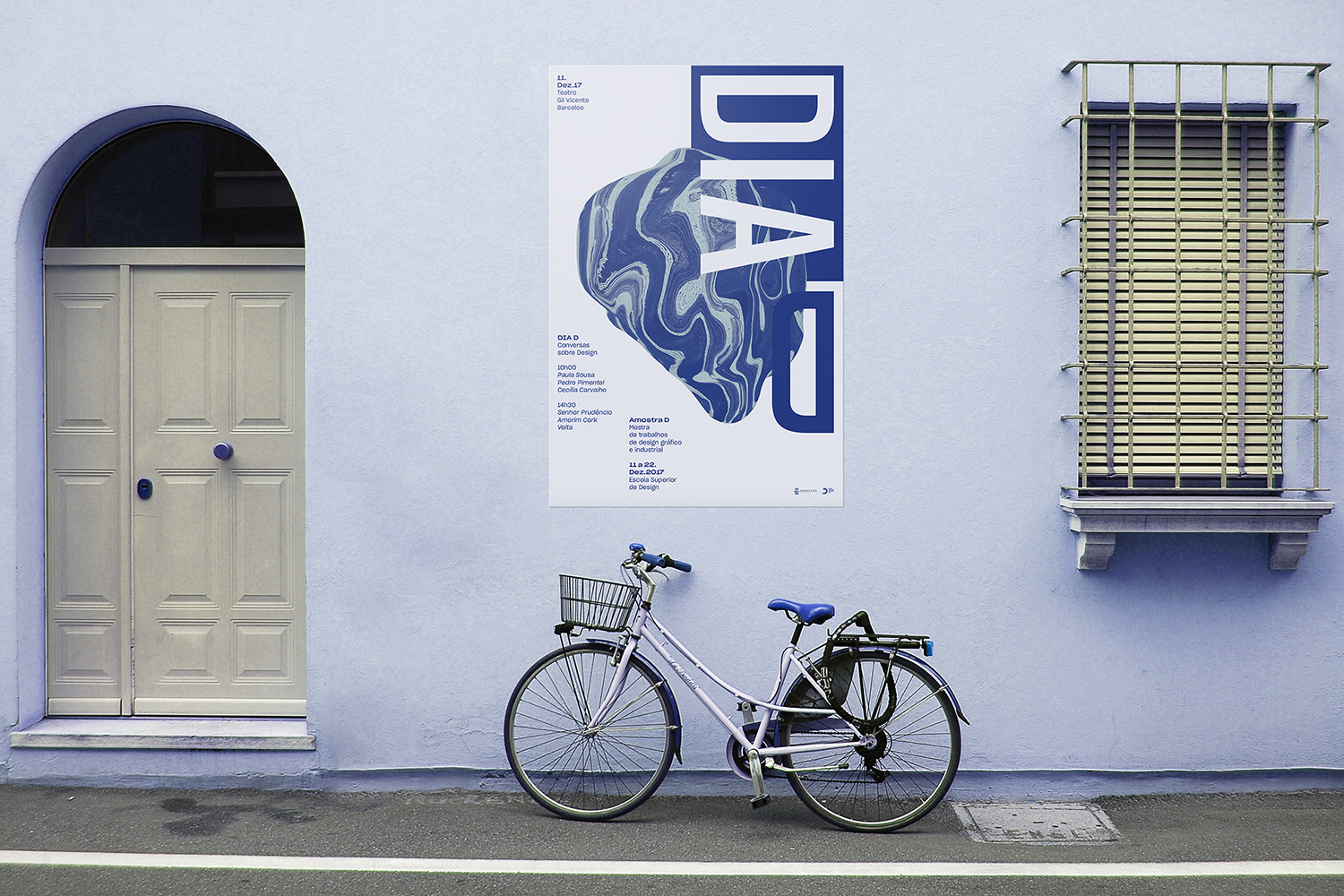
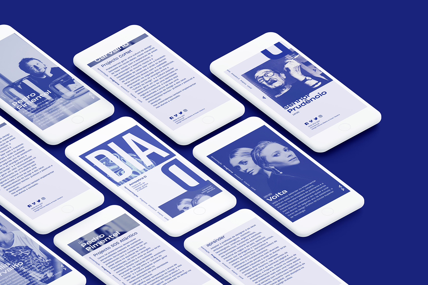
Dia D focuses on the Design process. As such the graphical approach to the visual communication of the event tries to synthesize this process. The theory is that design doesn’t start or end in the tools, but in what controls them, our minds.
As a way to synthesize the process that generates ideas, logic and abstract concepts, an image that is the result of a generative process was created.
This process is like a designers process. Both in the execution have an input with a series of parameters, specifications, and references. Based on the input the output is generated, and the generative process executed in that intermediate time is exclusive to each individual or machine.
With this philosophy and the help of software a versatile image was generated, that can or not be animated or reactive to stimuli.
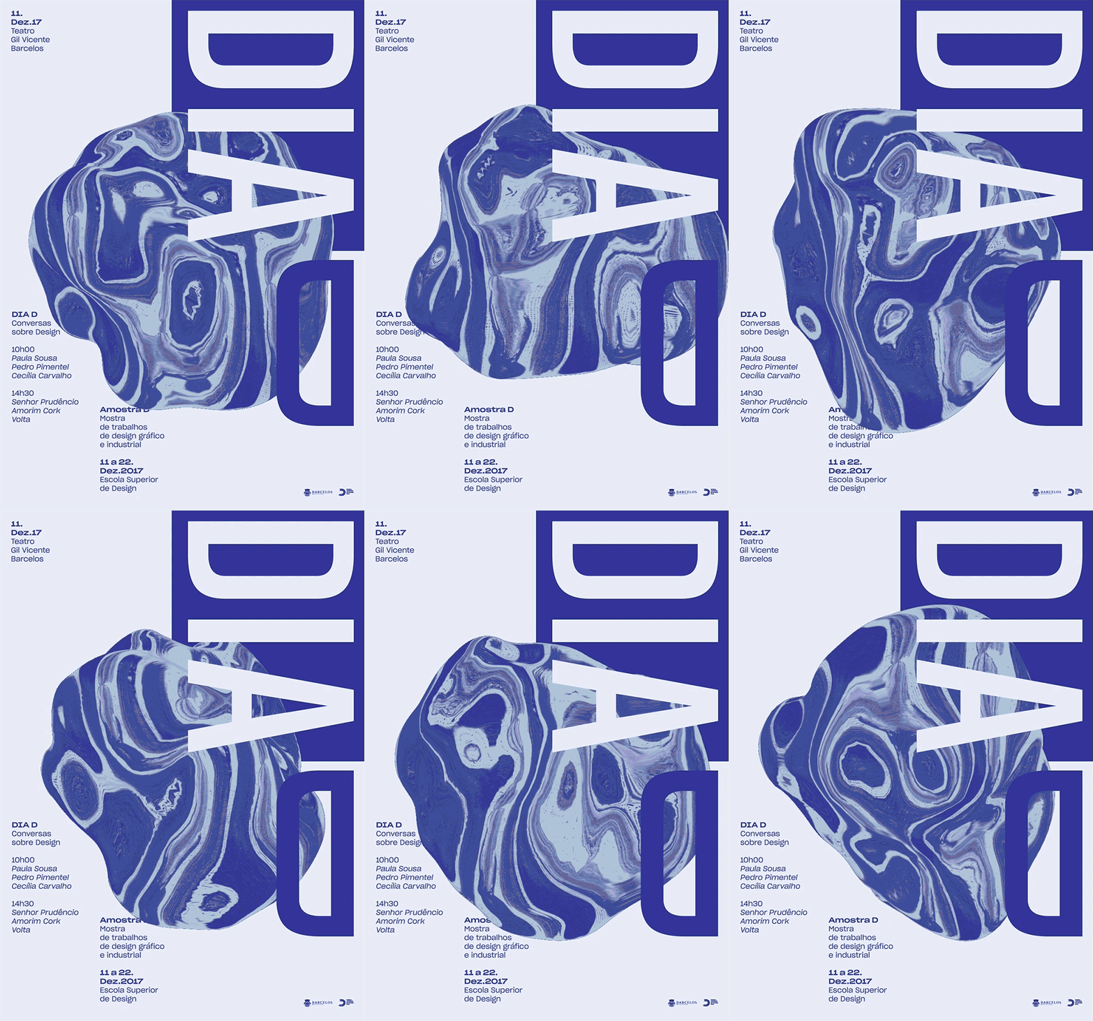 Motion graphic poster - Dimensions 500x700mm
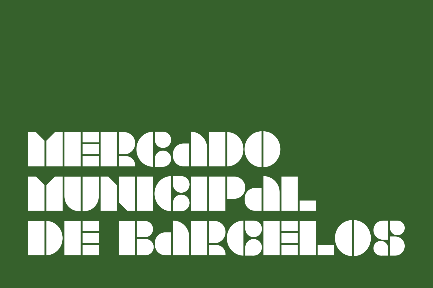


The square was the starting point since it is a geometric shape with a great presence in the physical realms of the market.


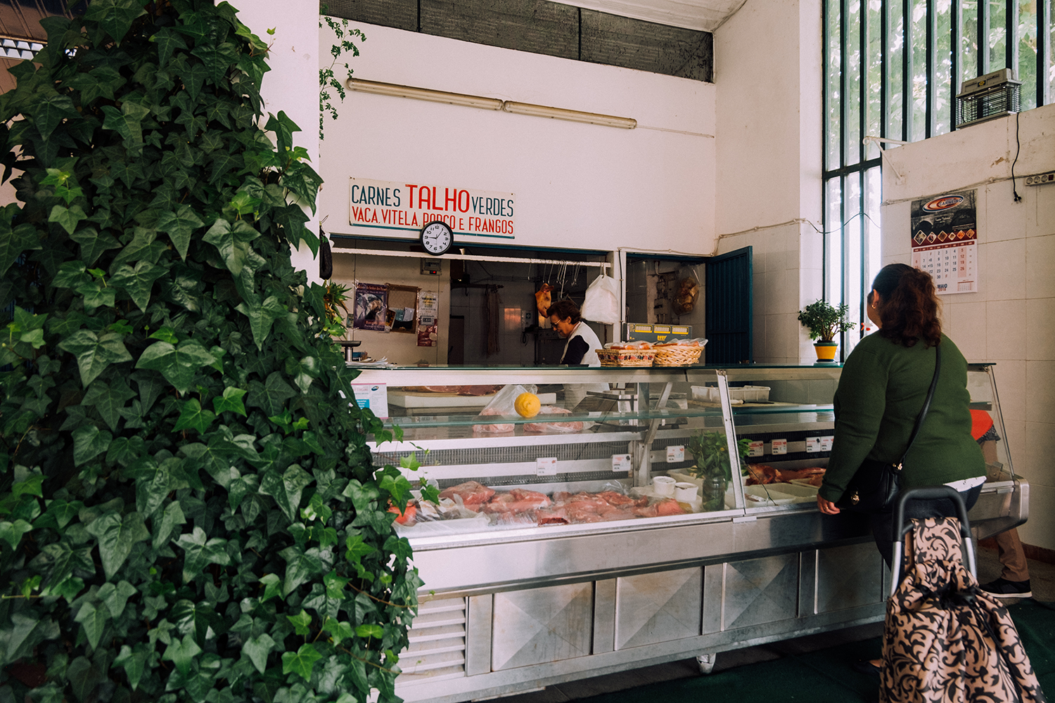


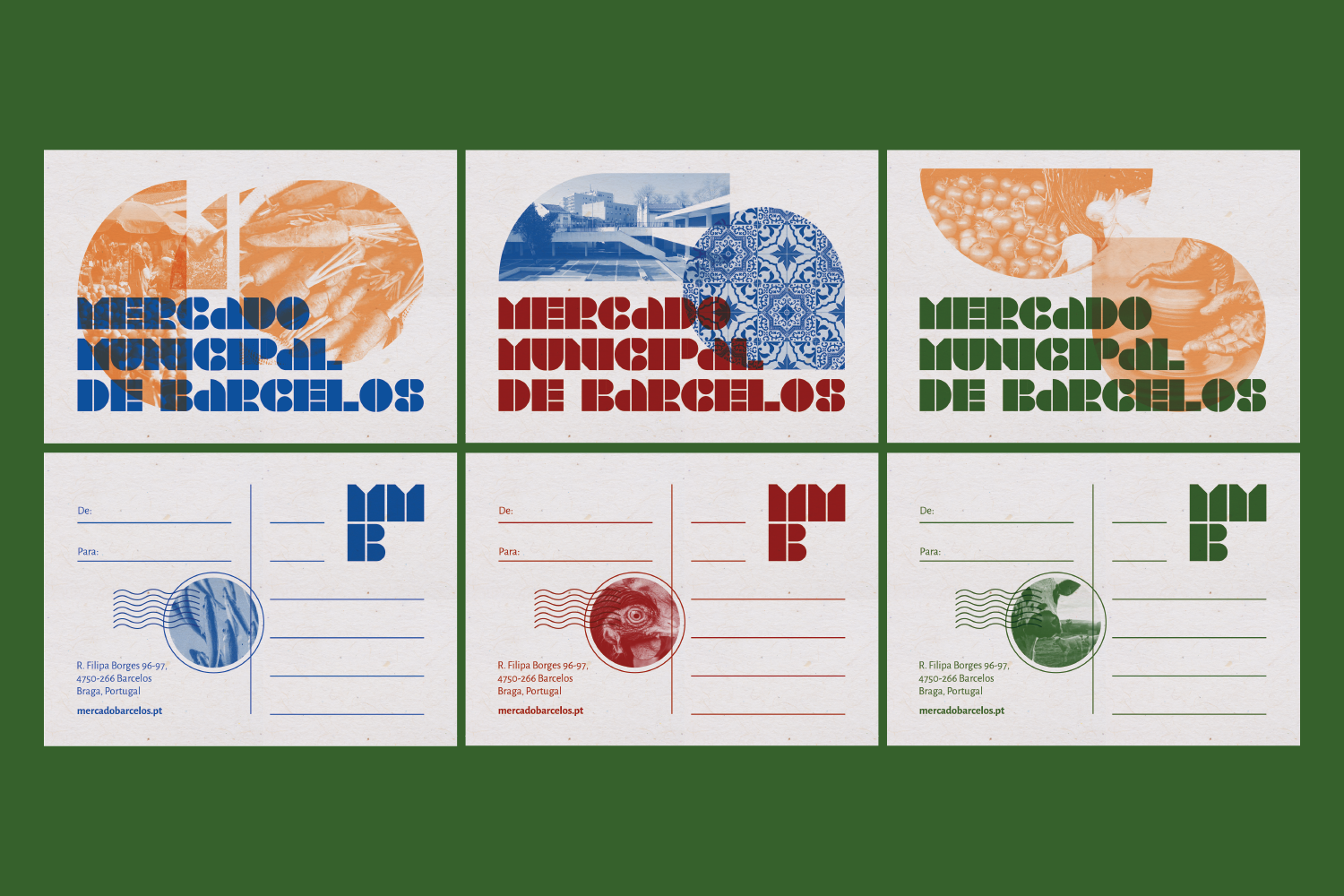
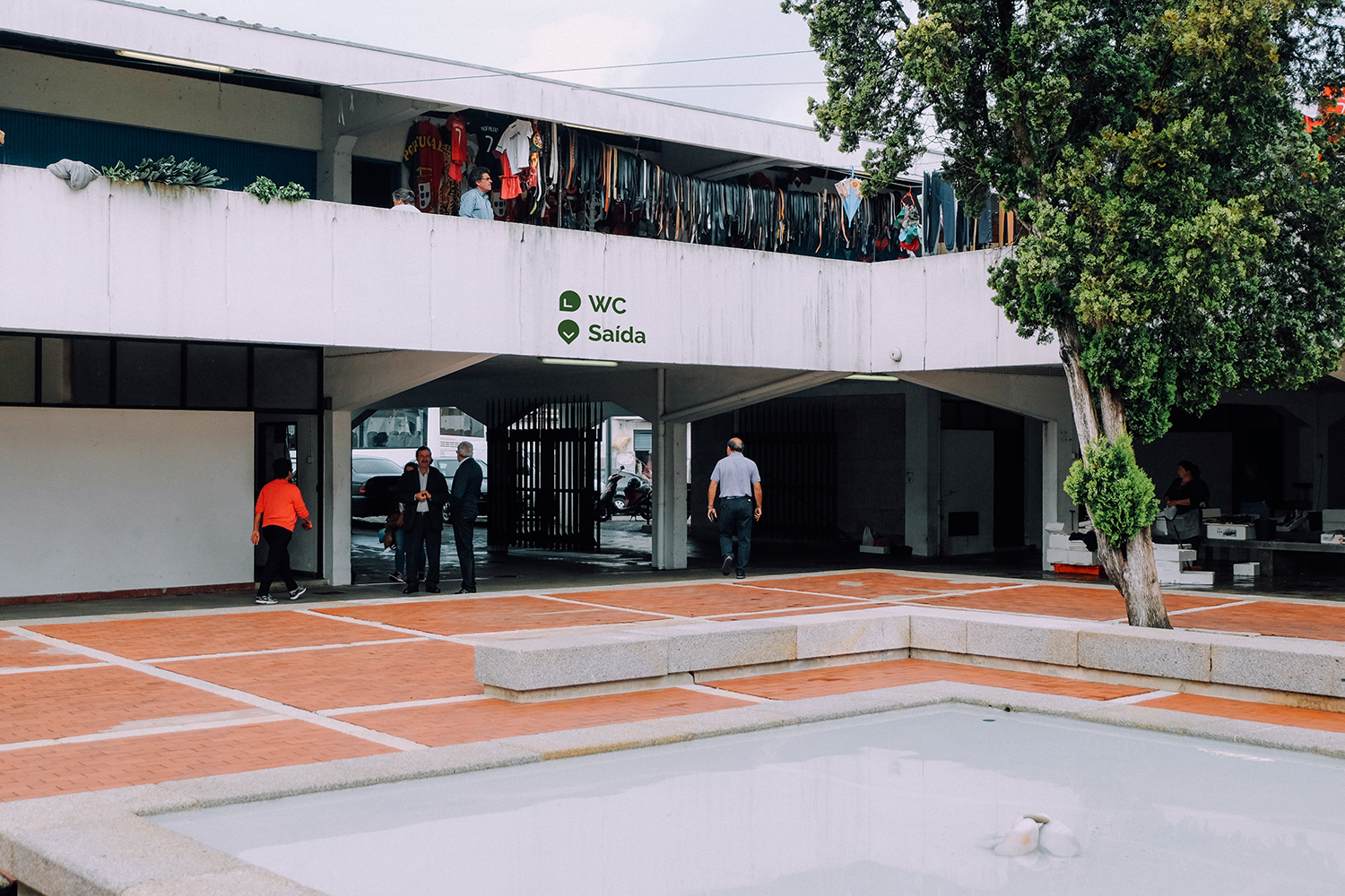

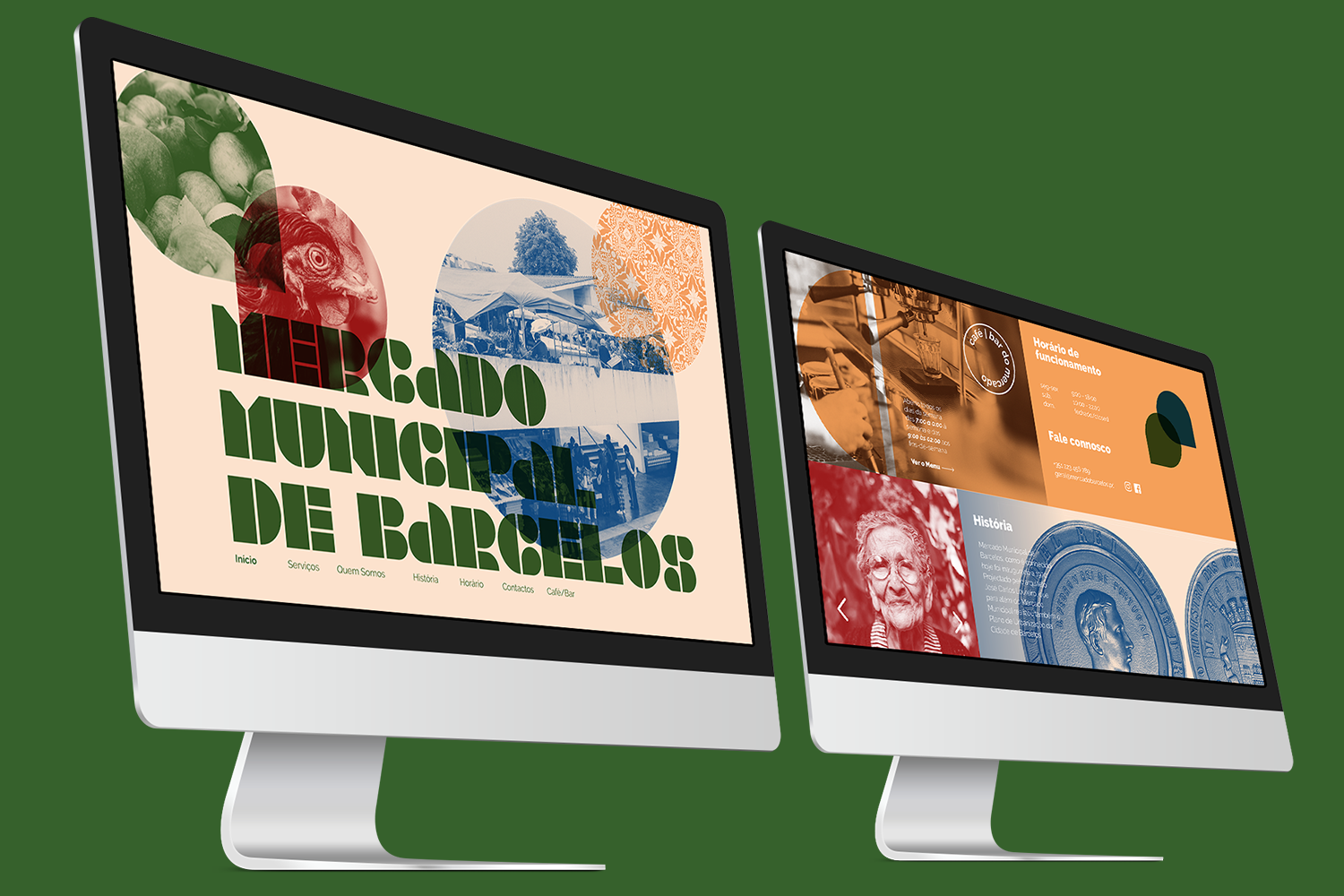

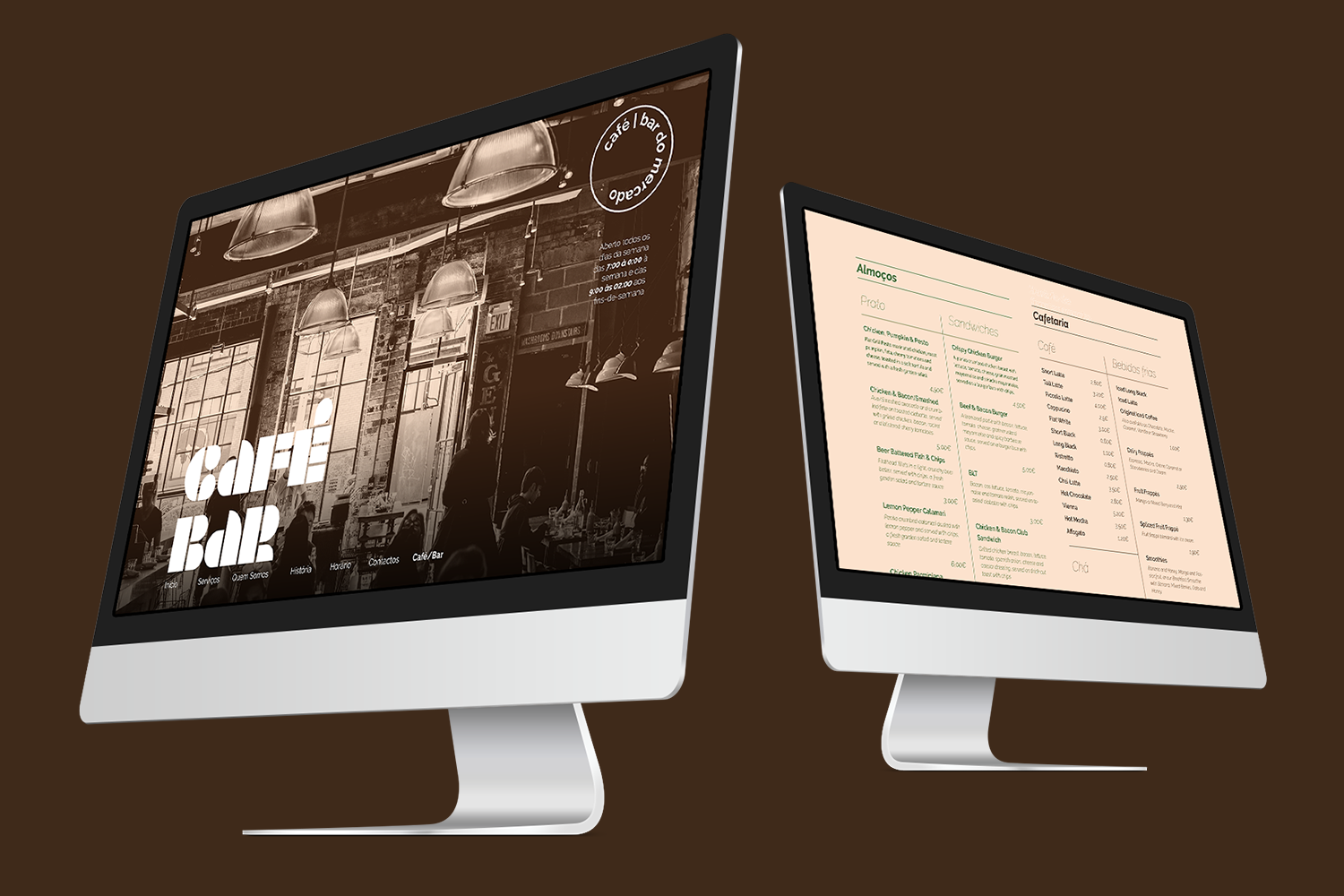

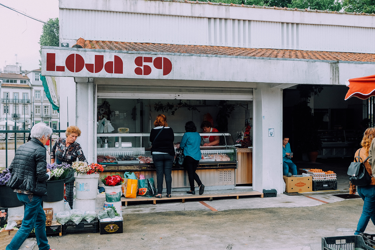
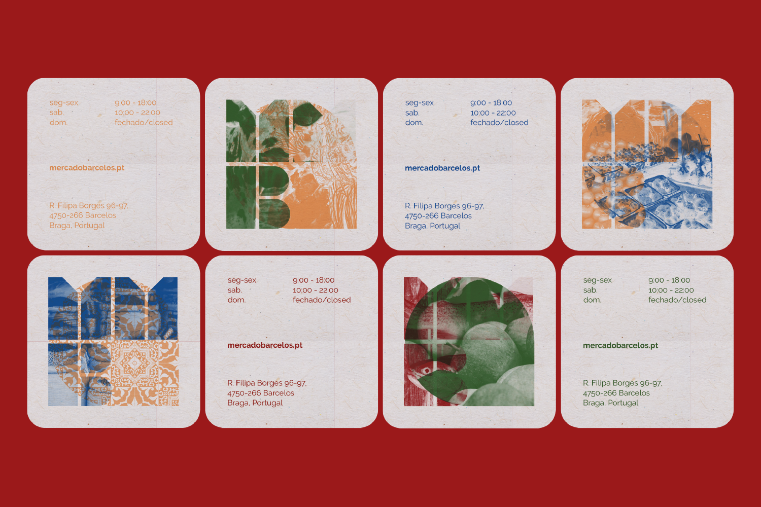
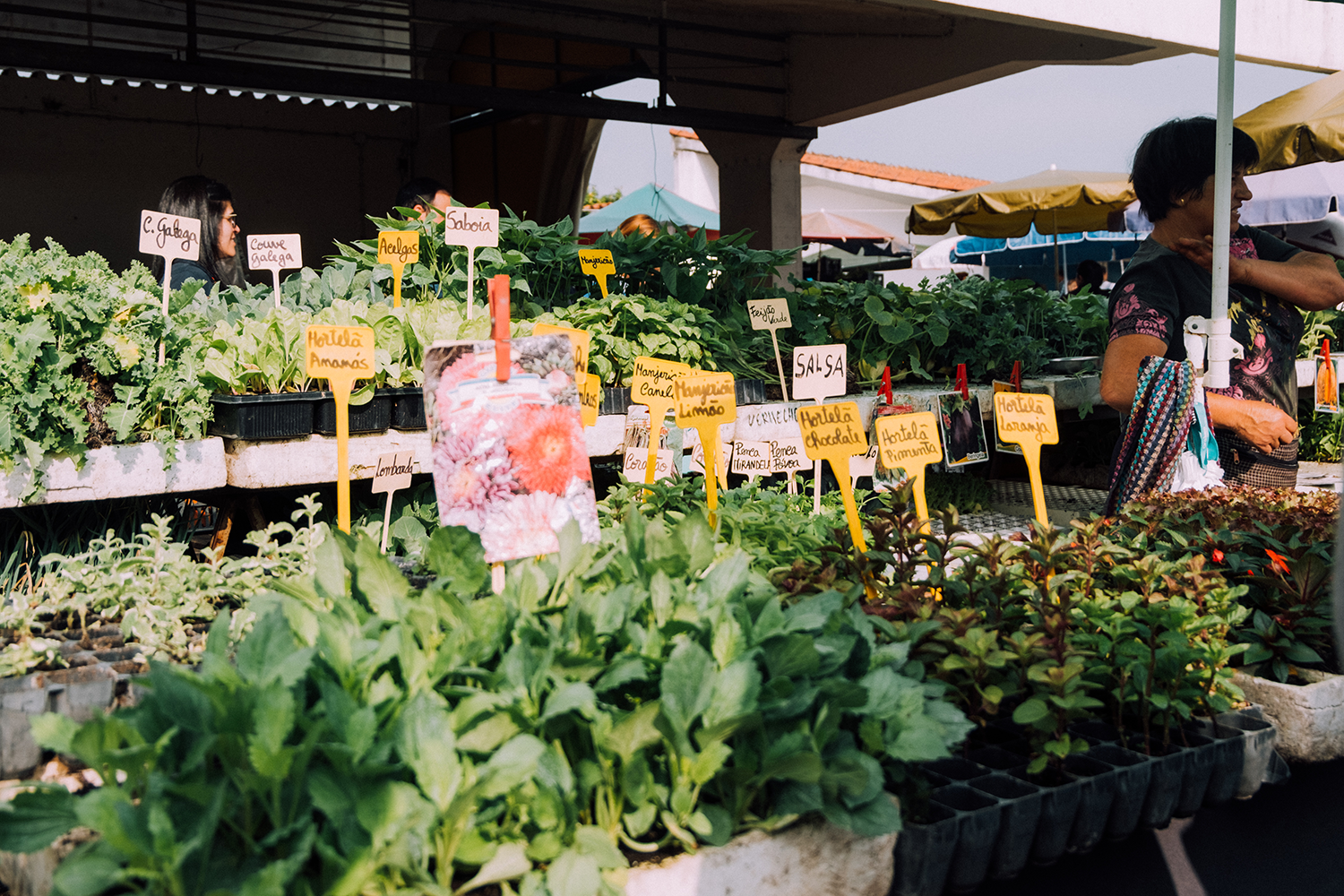
Mercado Municipal de Barcelos
The Municipal Market of Barcelos, as it is known today was inaugurated in 1970. Altho the market itself is already old, its origin and tradition are even older. It dates back to the reign of D. Pedro V, where its first name originated “D. Pedro V Market”.
One of the goals of the new identity is to complement the informal and friendly image of its merchants. To achieve this, it was a requirement that the brand image would be iconic, but at the same time transparent, so that ultimately the merchants are the true brand of the market.
It was also shown that it is important to preserve the historical heritage of the space since it will be rehabilitated soon. After extensive research, it was concluded that the best solution was to create a modular identity, given the large number of services and the complexity of the space.
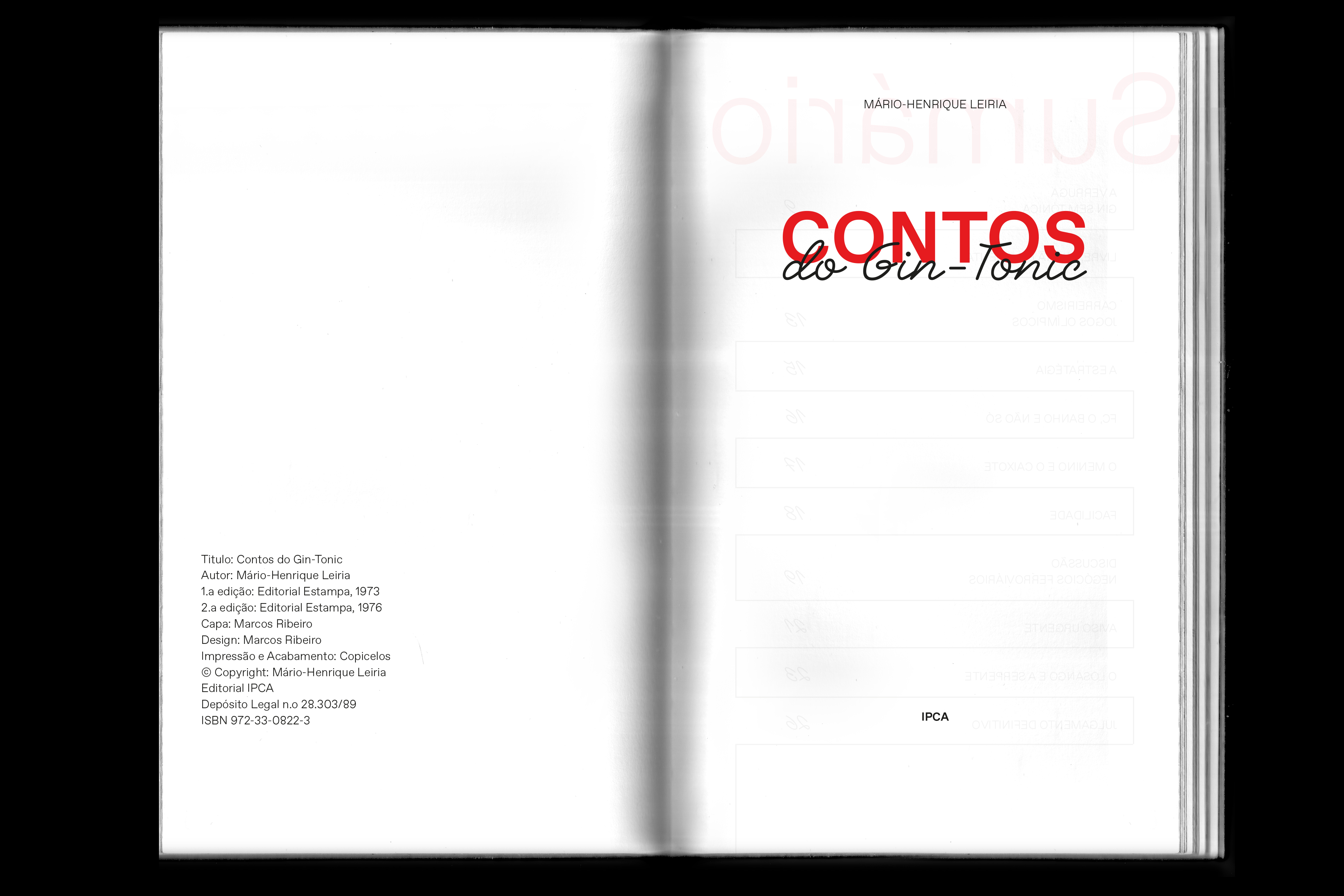


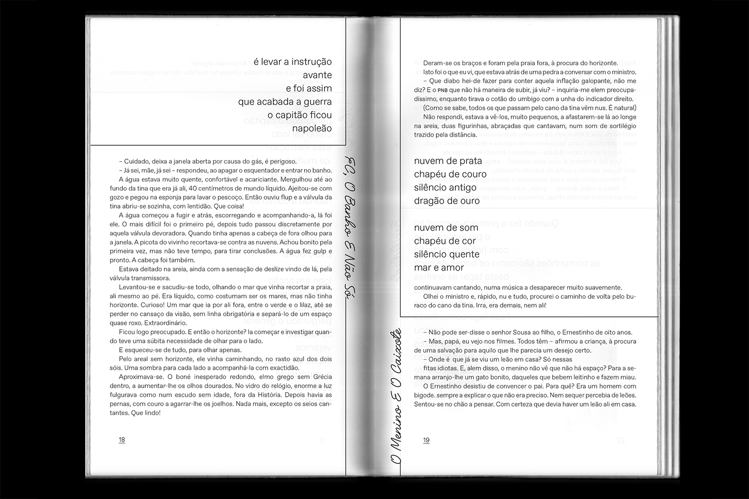


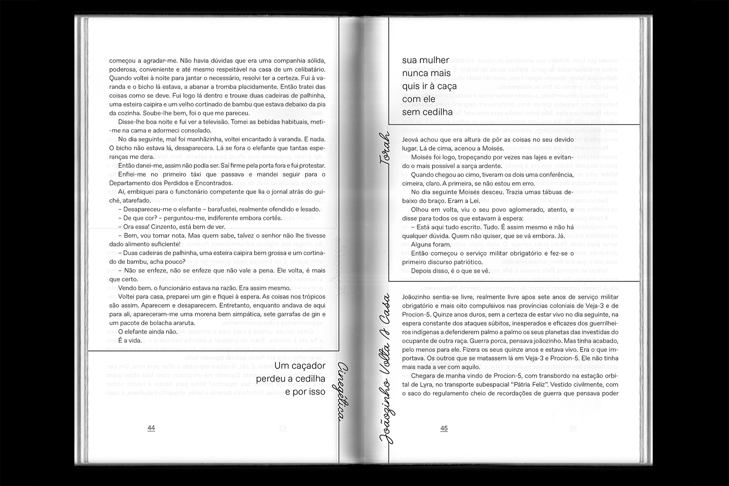


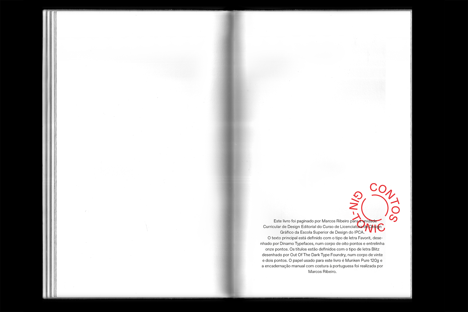
Contos do Gin-Tonic
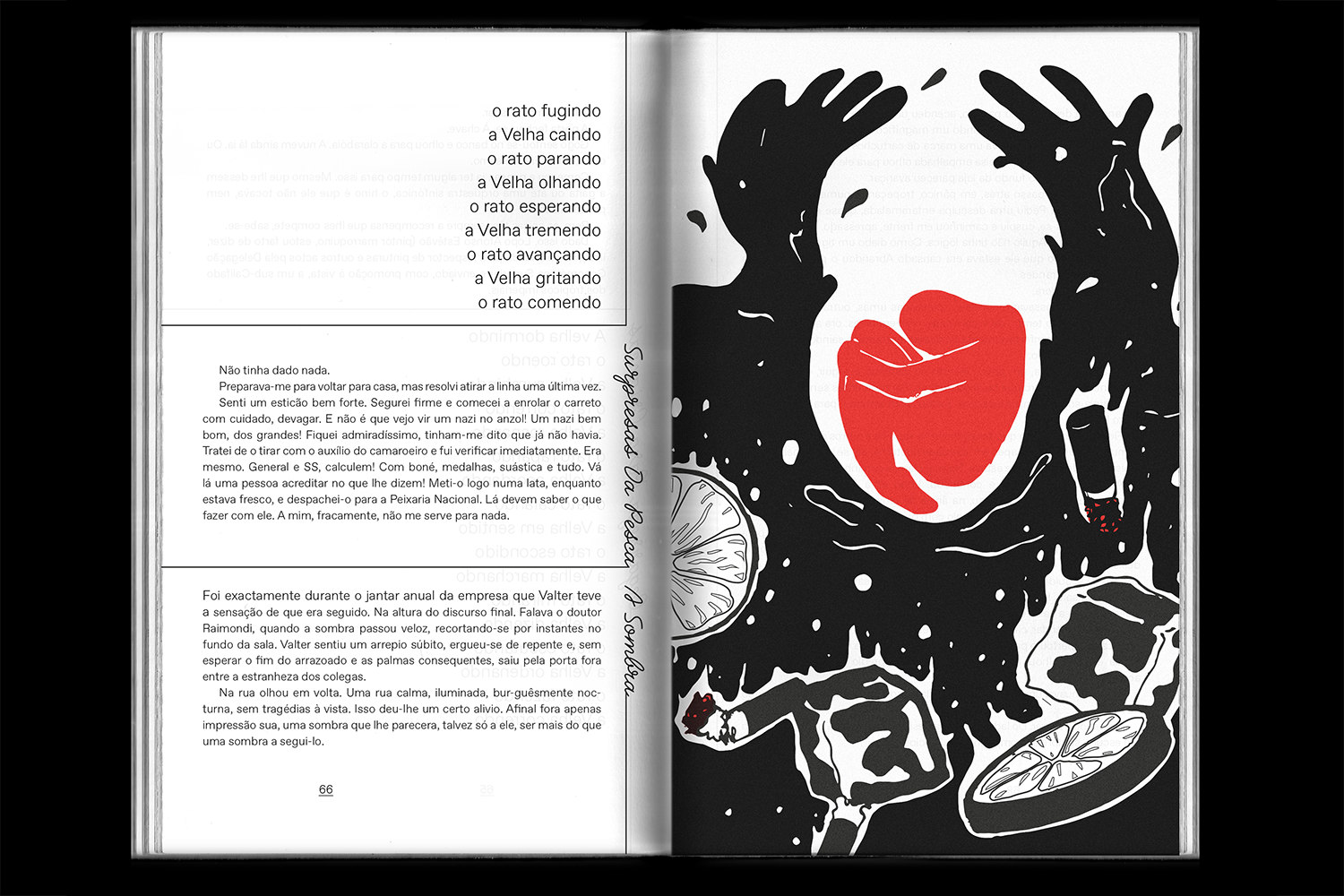
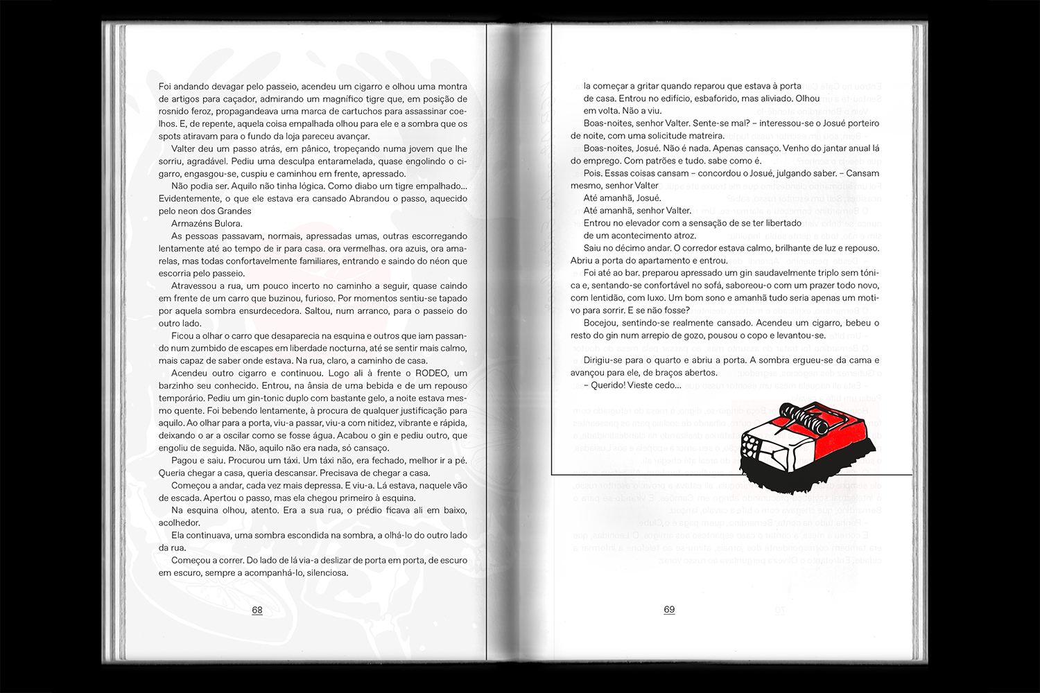
was written by Mário-Henrique Leiria and it was first published in 1973. The book is a compilation of several tales with a bohemic and surrealist tone.
The graphic choices, like the script titles that resemble neon type, match the tone of the tales, creating a fluid reading, jumping from tale to tale, like in a night out, jumping from bar to bar. To create dynamism the text in verse is set in a different size and aligned to the spine of the book, and the page numbers advance to the right at every page turn.
