client Timeline®
Head of Design Isha Suhag
Art Direction Isha Suhag + Marcos Ribeiro
3D Animation & Renders Fabio.zip + Sebastian Helene
Socail Media Scout Digital
UI/UX Design Lorenz Wöhr
Art Direction Isha Suhag + Marcos Ribeiro
3D Animation & Renders Fabio.zip + Sebastian Helene
Socail Media Scout Digital
UI/UX Design Lorenz Wöhr
project type
Rebranding + Packaging + Art Direction + Illustration + Ads + Social Media + Blog + Email Design + Spacial Design + Editorial Design
Rebranding + Packaging + Art Direction + Illustration + Ads + Social Media + Blog + Email Design + Spacial Design + Editorial Design
year 2021 — 2023
Timeline is a swiss biotech startup, that develops and sells unique and innovative nutrition and skin health products.
Backed with 15+ years of research and numerous clinical trials, Timeline® offers unique Nutrition and Skin Health products that improve health and healthspan, by targeting mitochondria (the powerhouses of our cells) and activating the pathways to renew them. Granting them a unique place on the supplement and cosmetic markets.
Visit the Timeline®’s website ︎︎︎
Altho the organization has been developing it’s products for a log time and had just brought them to the market, it was not yet reaching enough audience and was having a tough time competing with the more established supplement brands.
The challenge was to update it’s outdated visual identity, to better align it with their core values rooted in extensive scientific research and continuous testing. As well as to enabele it to accelarate growth, scale and expand, giving it all the tools to become a global brand.
The challenge was to update it’s outdated visual identity, to better align it with their core values rooted in extensive scientific research and continuous testing. As well as to enabele it to accelarate growth, scale and expand, giving it all the tools to become a global brand.
The solution was a well thought-out and strategicly planned re-branding project, that kept the already established parts of the previous brand, such as the logo, and updating the rest of it’s components to better fit today’s communication channels landscapes and enabeling it to compete in it’s distinct product markets.
Table of Contents
1. Brand Visual System
2. Art Direction
3. Packaging
4. Advertising
5. Social Media
6. Blog & Newsletters
7. Spacial Design
8. Editorial Pieces
Table of Contents
1. Brand Visual System
2. Art Direction
3. Packaging
4. Advertising
5. Social Media
6. Blog & Newsletters
7. Spacial Design
8. Editorial Pieces
Brand Visual System
The new brand visual system preserves key elements from its predecessor, including the logo and typefaces, as they perfectly align with Timeline®'s core values of innovation, Swiss identity, and methodical scientific research.
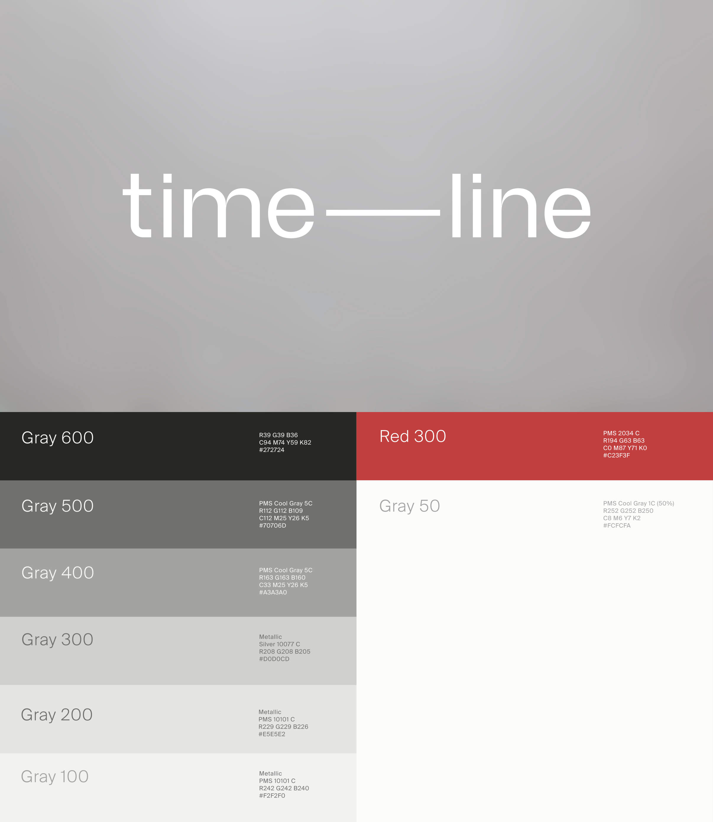
Expanding upon this foundation, the color scheme has been modernized, transitioning from undertone pastels to a more neutral and clean palette. Incorporating various shades of gray provides flexibility in creating new assets, with a carefully established ratio of light gray to darker tones to impart a light and clinical ambiance. Introducing an accent color (Red 300) serves to make specific elements stand out, functioning as a device to convey the Swiss identity of the brand and highlight its unique selling proposition of delivering products that improve energy and healthspan. Given Timeline®'s status as a high-end modern brand, silver takes a prominent role in the palette, becoming one of the most recognized and distinctive colors in the brand identity.

Art Direction
In the realm of Timeline's visual storytelling, the art direction for photography and video underwent a meticulous conceptualization process, intricately weaving together the brand's foundational values of science and innovation. The overarching goal is to convey a clean, objective, and clinical sensation, ensuring that every visual element mirrors the brand's commitment to precision and advancement.
Conceptualization: The art direction places an unwavering spotlight on the main subjects, deliberately devoid of distractions, creating a visual narrative that is both focused and modern. To authentically connect with our diverse customer base, models are chosen to represent a varied spectrum of individuals, fostering relatability and inclusivity. At the heart of this approach lies the celebration of aging optimism, where models confidently showcase fine lines, embracing the beauty that comes with the passage of time.
Visual Style: Embracing a minimalist ethos, the visual style of Timeline's photography and video assets is a strategic choice. This minimalism not only reinforces the brand's clinical and scientific ethos but also grants unparalleled flexibility. The light gray background, a consistent element across assets, serves as a neutral canvas. This neutrality allows for seamless integration with text, graphics, and other design elements, ensuring readability and cohesiveness.
Flexibility and Consistency: The versatility of this visual approach extends beyond traditional photography, encompassing video content, product renders, and various creative assets. This intentional consistency is designed to foster a unified brand identity, where lifestyle imagery seamlessly aligns with the same visual language as product-focused content. This unified approach enhances the overall brand experience, promoting recognition and resonance across diverse touchpoints.
In essence, Timeline's Photography and Video Art Direction encapsulates a deliberate blend of precision, diversity, and flexibility, creating a visual narrative that resonates with the brand's ethos and speaks to a broad audience.


Skin Health Packaging
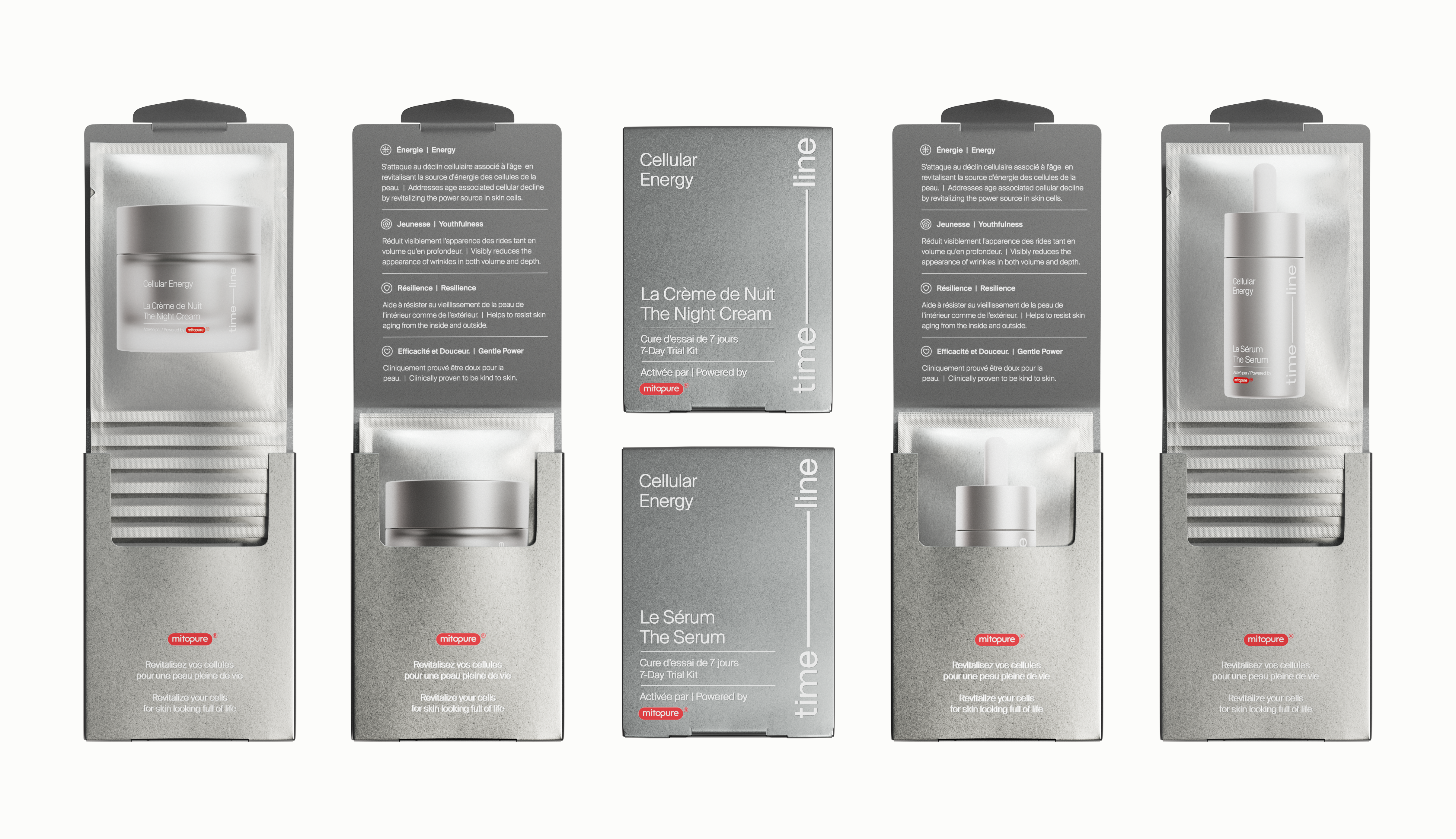
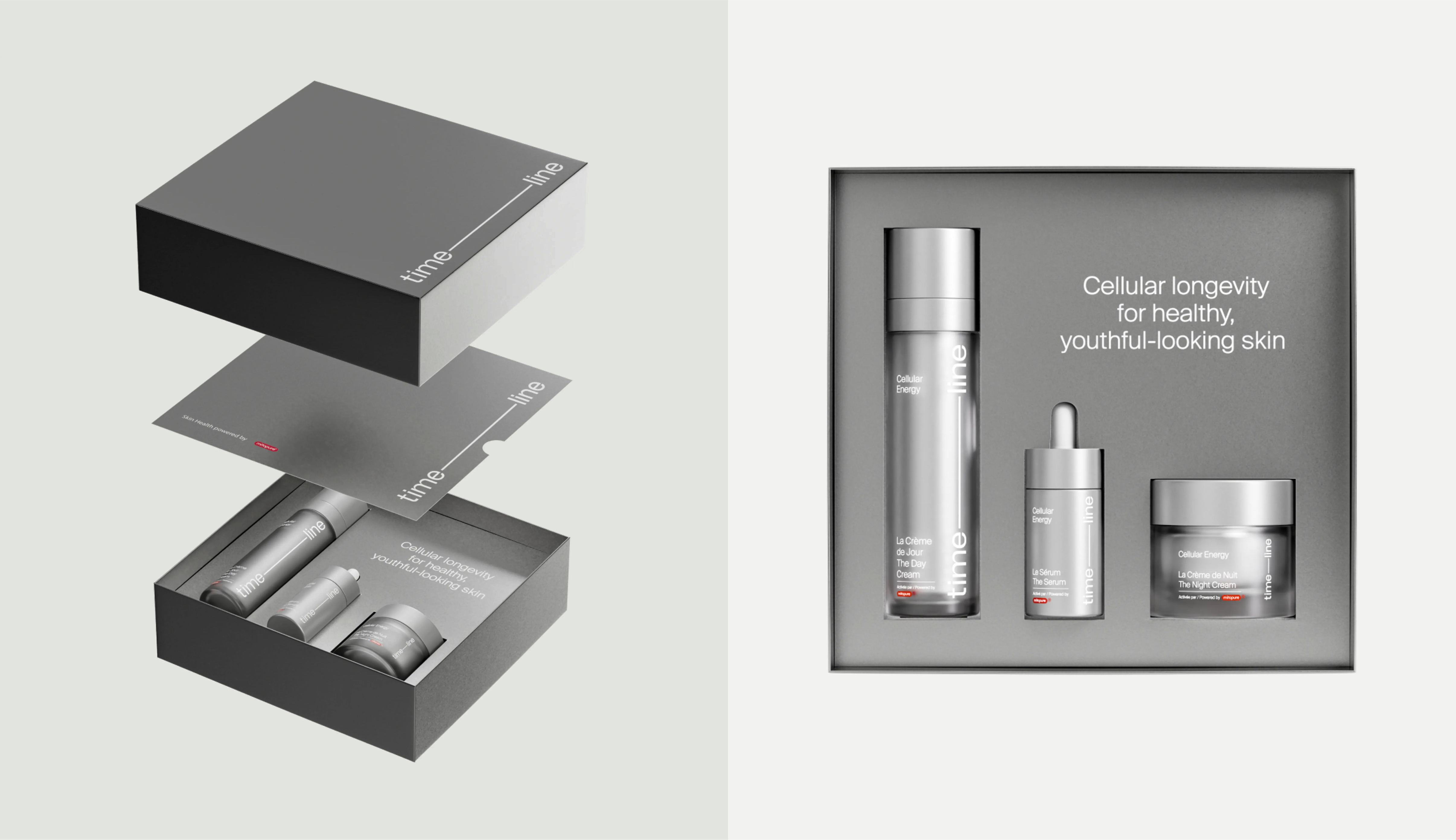
The redesigned packaging for the Skin Health product line of cosmetics by Timeline is a visual embodiment of the brand's core values. The use of the silver color and minimalist shapes not only provides a sleek and modern aesthetic but also ensures gender neutrality, a crucial aspect in today's diverse market. Sustainability is at the forefront, with the incorporation of recyclable materials, reusable components, and FSC-certified paper for the secondary packaging. Recognizing its global audience, the packaging adopts a Bilingual Design System. The printing techniques employed, including Silver Foil, Debossing, and Offset Print, add a touch of luxury and sophistication. While maintaining consistency with the Nutrition Line, the updated layout, typographic styles, and color palette ensure that both nutrition and skin health products are visually connected under the Timeline brand yet distinct within their respective categories.




Advertising
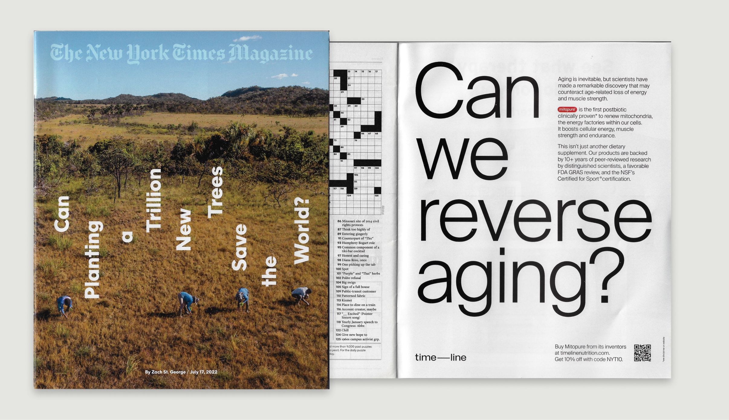
In the realm of advertising, Timeline's brand communication reaches potential customers through a meticulously crafted visual representation, a pivotal aspect across digital and offline channels.
The newly established art direction takes center stage in this communication strategy, seamlessly incorporating vibrant lifestyle and product photography. The minimalistic yet positive approach employed in these advertisements distinguishes Timeline from competitors, with a unique emphasis on not only highlighting product benefits but also conveying a sense of gravitas that instills trust in the information presented. This gravitas stems from the brand's commitment to transparency, underpinned by extensive research and clinical trials, ensuring that potential customers are not only enticed by the visual appeal but are also well-informed and confident in the brand's offerings.
This deliberate and thoughtful approach to advertising underscores Timeline's commitment to both aesthetic excellence and the dissemination of reliable information, setting the brand apart in a competitive landscape.
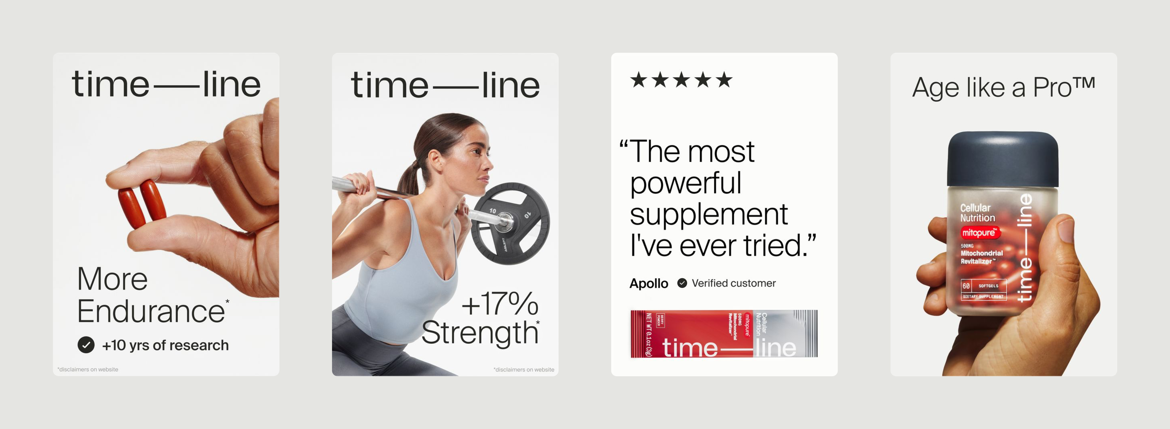
Social Media
In the realm of social media design, Timeline adopts a strategy akin to its advertising endeavors, employing minimalistic compositions and integrating the new lifestyle and product photography to maintain a cohesive visual identity. However, the focus here diverges, with the primary goal being the education and expansion of Timeline's community. This necessitates a more flexible approach, incorporating various external assets while adhering to stringent brand guidelines to maintain on-brand consistency. The deliberate application of brand graphic elements, including the logo, layout, and typefaces, ensures that each communication piece not only educates but also seamlessly aligns with the overarching brand identity, fostering a unified and engaging presence across social media channels.
Blog & Newsletters
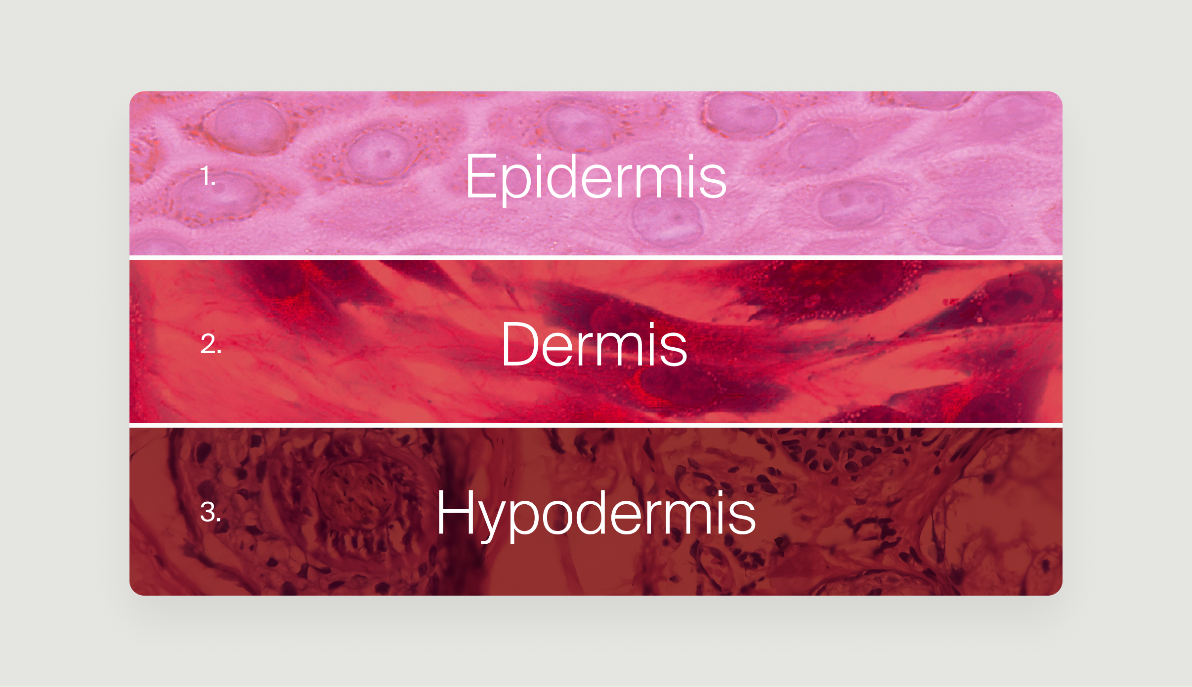
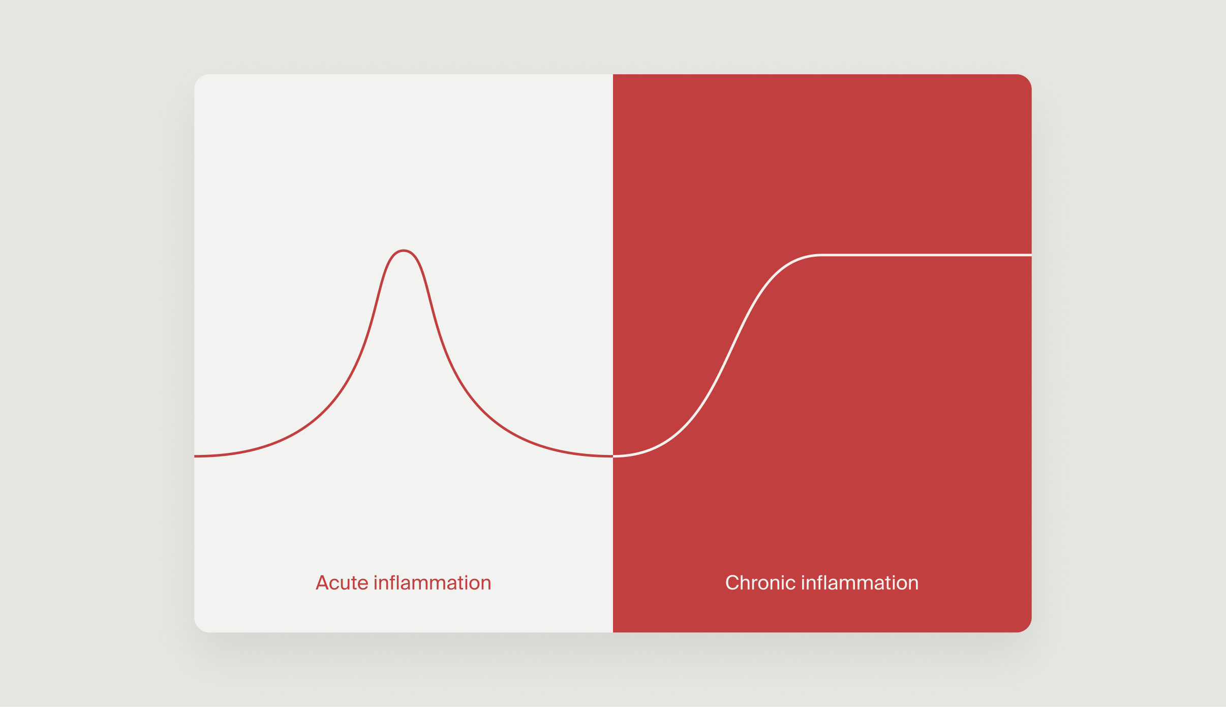
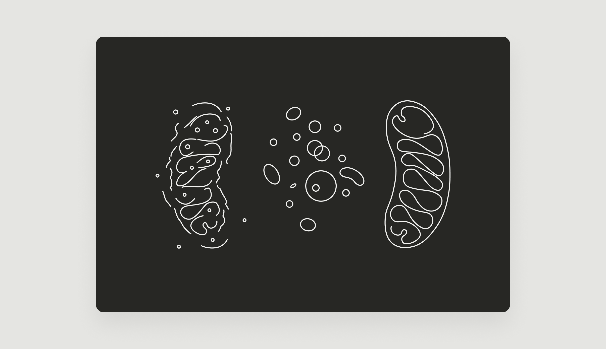
The blog serves as a pivotal platform for educating and expanding Timeline's community by delving into diverse topics related to health, science, and studies. In this space, design plays a fundamental role, acting not only as an illustrative force to visually convey complex concepts but also as a means to make these subjects accessible and engaging. Through the integration of compelling graphics and infographics, the design ensures that even intricate ideas are presented in a manner that aligns with the brand's identity and values, fostering understanding across a broad audience. The visual elements on the blog not only enhance the overall aesthetic but also contribute significantly to the brand's educational mission.



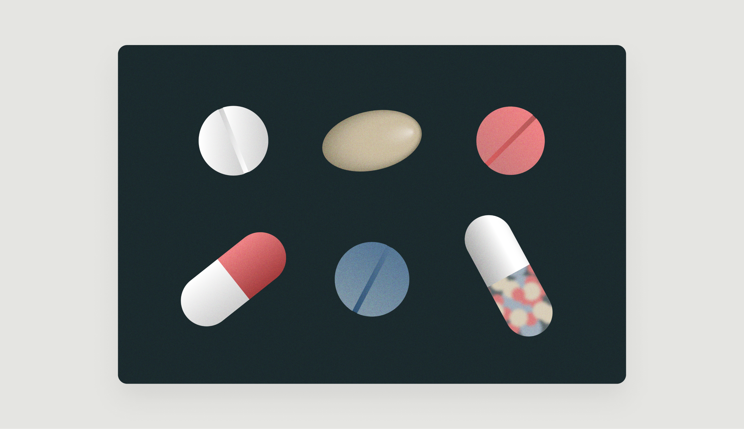


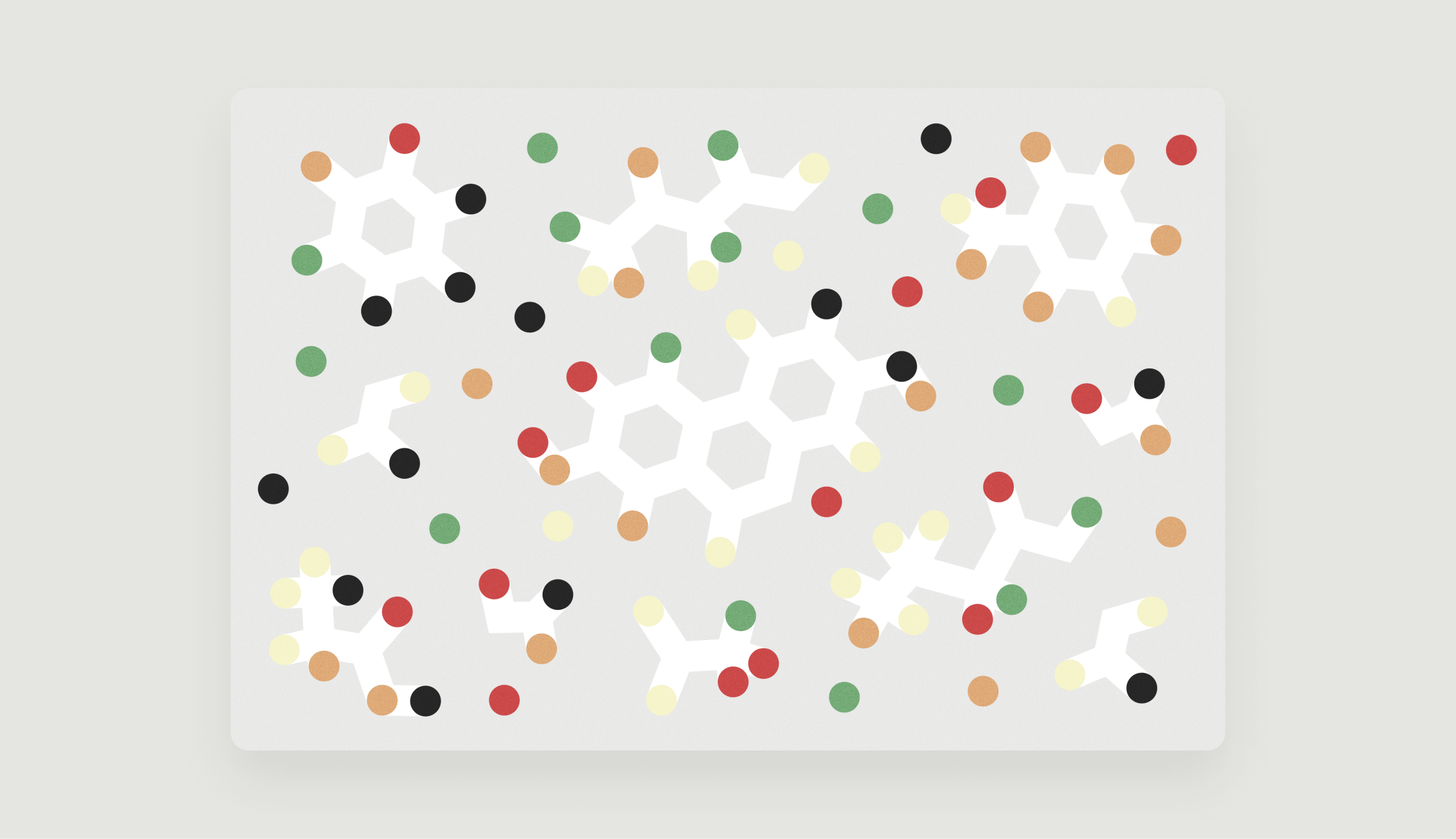


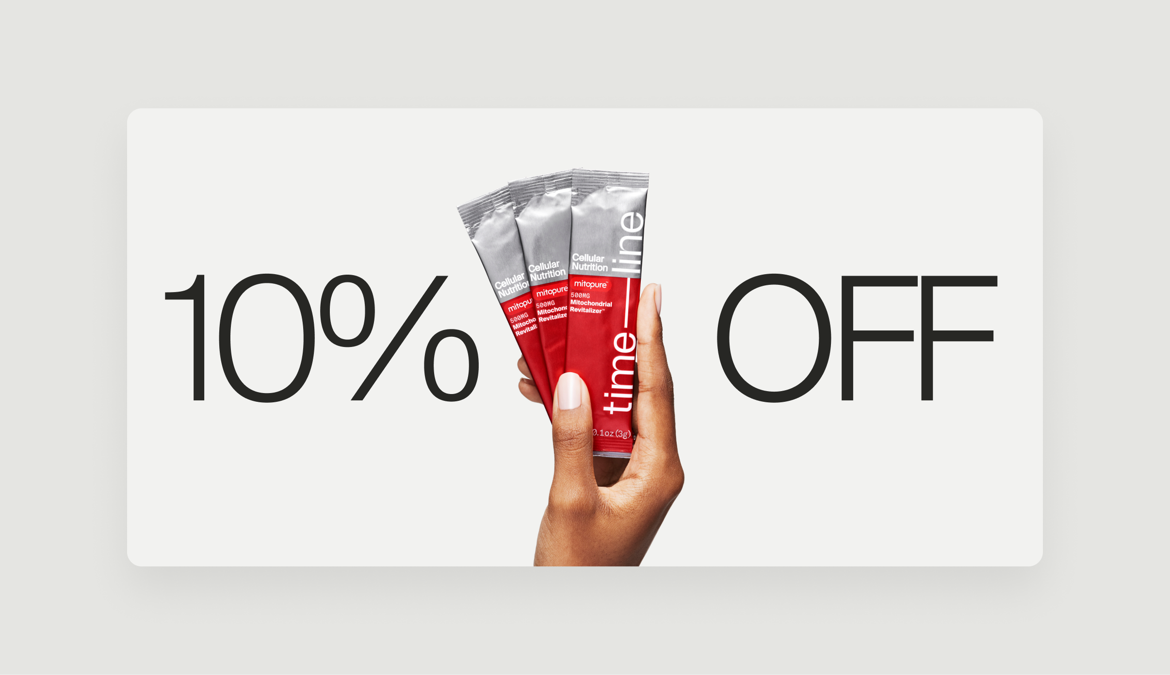
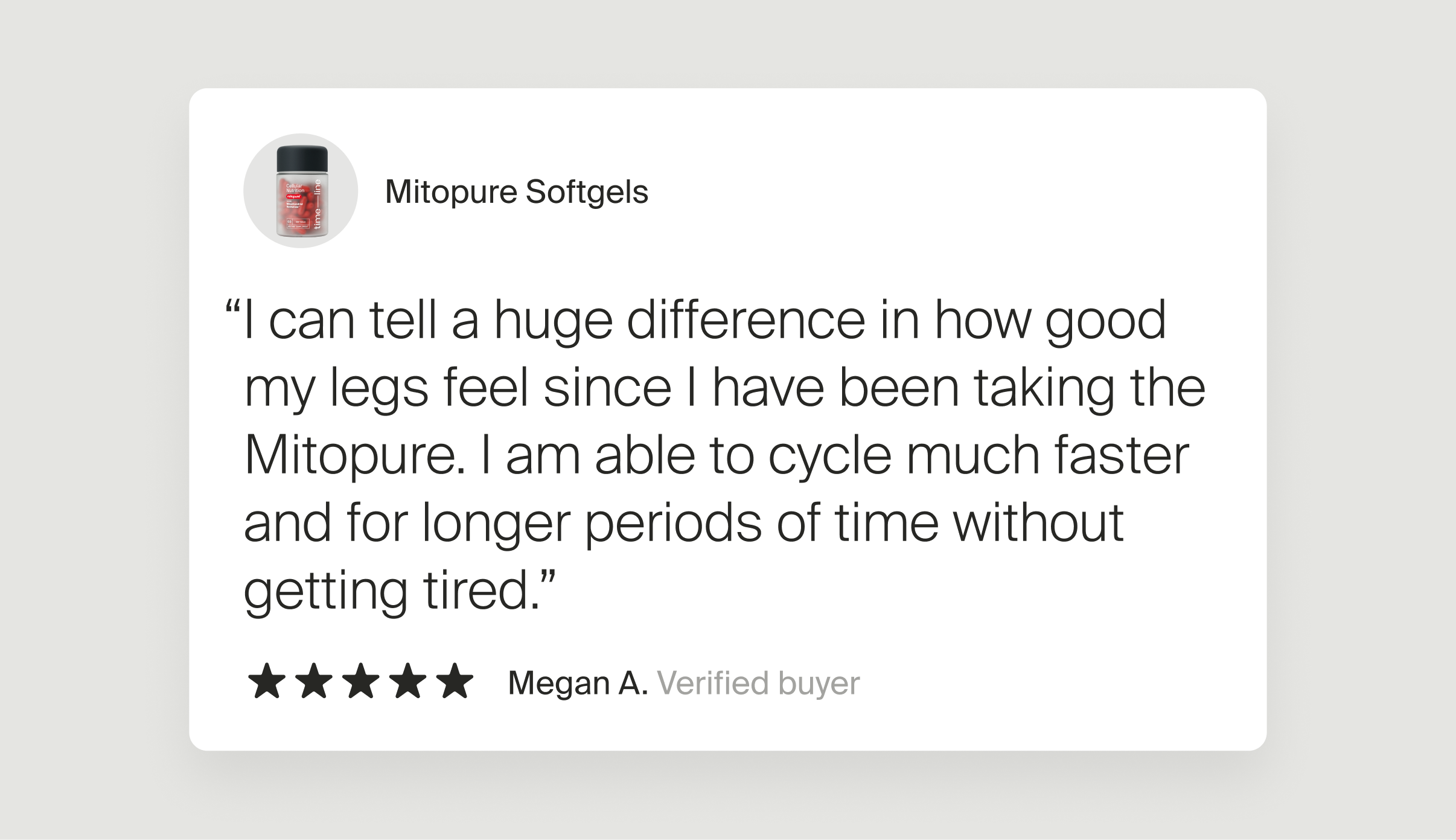


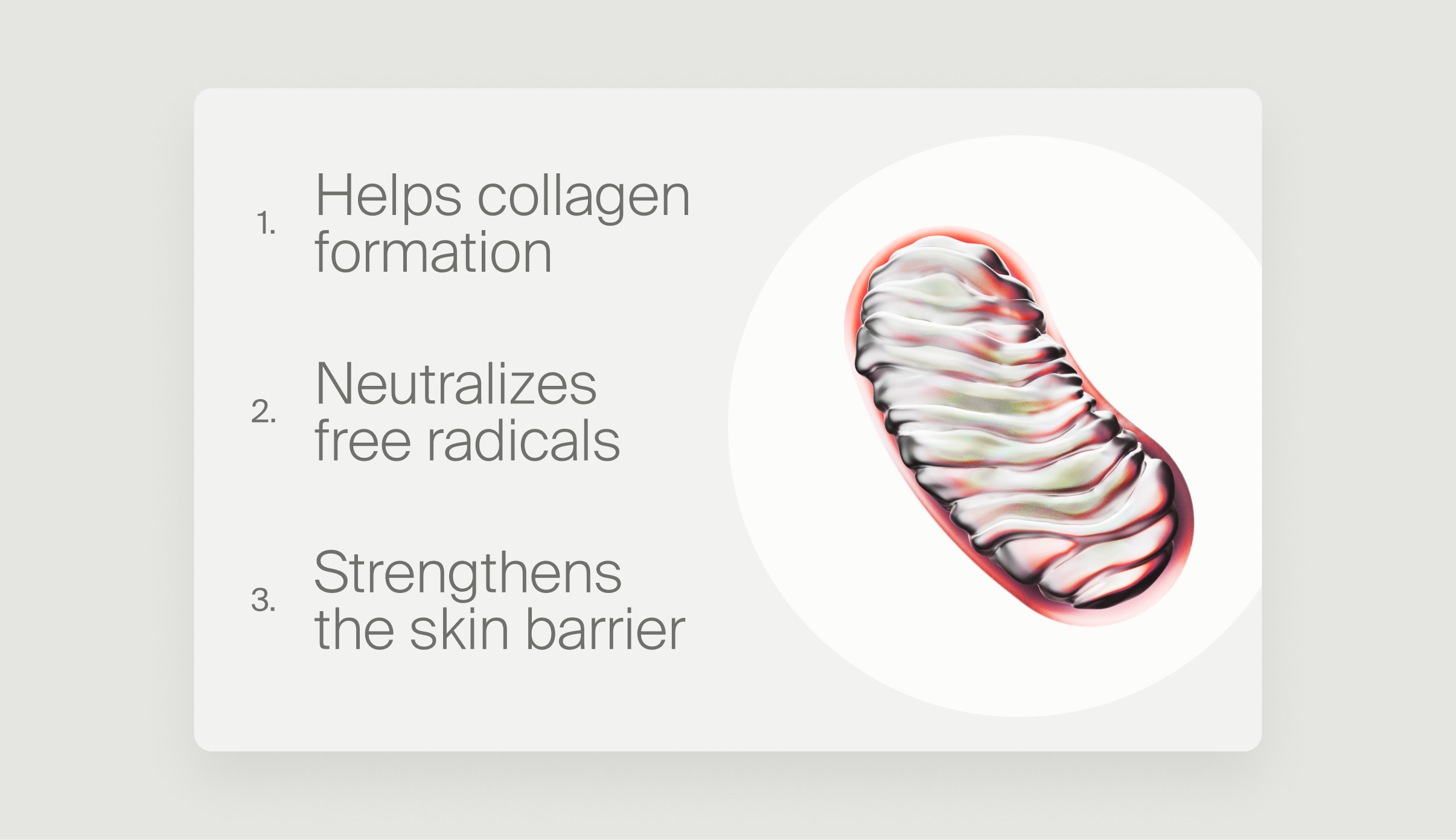

Email newsletters, akin to the blog, play a crucial role in educating and updating Timeline's community. Beyond being an informative channel, newsletters serve as key communication tools for announcing new products, events, podcasts, scientific studies, discounts, and promotions. These pieces of communication are integral to keeping the community informed and engaged. The newsletters maintain a seamless visual identity, incorporating the brand's photography and bespoke illustrations consistent with its overall aesthetic. By leveraging these design elements, the newsletters not only convey information effectively but also contribute to sustaining a sense of community and connection among faithful members.
